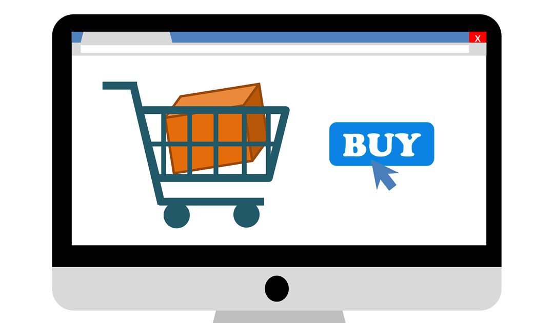
CTAs are some of the most powerful and important elements on your website to support your Inbound Marketing efforts.
Call-to-Actions and Conversions
A conversion happens when a website visitor responds to a desired event on your website, like clicking a button to fill out the contact form, sign up for a newsletter or make a purchase. When that person enters their contact information, you have converted that website visitor into a lead, and therefore has entered your sales funnel.
With a carefully thought out call-to-action, it can influence how a visitor navigates your website.
Here are some common call-to-action phrases:
- Add to Cart
- Subscribe now
- Get our Newsletter
- Read More
- Share on Facebook
- Download
How to Create Effective Calls-to-Action
In order for CTAs to be effective, it must be easily seen, appealing or inviting, understandable and relatable. Did you know that the placement and design of your CTA on a webpage are important?
Here are some tips on the placement of Call-to-Action buttons or links:
- Put multiple CTAs on one webpage. All webpages should have a CTA. There should be enough CTAs on a page to get more opportunities for visitors to be converted, but make sure that you don’t put too many or it may overwhelm visitors.
- The natural reading orientation is top to bottom, left to right. Also take into consideration that 90% of people are right handed. Make sure to have CTAs above the fold, aligned on the center or right side. By the time the user reaches the middle of the webpage, there should have been two CTAs already.
Designing your CTAs matter, here are some tips:
- Strive for two things in creating your CTAs: clarity and good visual. Make sure to use the appropriate phrases to deliver the right message to the user and also choose the right color, shape, font and icons to evoke feelings. Remember that good design, translates to good business.
- In selecting a color for your CTA, understand the color theory and color psychology. As an example, for add to cart buttons, it’s better to use the green color instead of red. Also avoid light on light or dark on dark, but it also depends on how you design that area.
- Give it space. Make sure that there is enough space around the button. The negative space or margin helps to highlight the button.
Furthermore, to help you in customizing CTA phrases you can use the formats below in different ways:
marketing buzzword + action words = Free Download
optionally, you can also add the name of the material/business at the end:
marketing buzzword + action words + name of material/business = Download Free E-book
When you plan and optimize your Calls-to-Action to be simple and appropriate, it can have a positive effect on website conversions. Below are ten of the most common Call-to-Action phrases that you can use for your website or digital marketing:
E-commerce
Buy now, Shop, Order Online, Reserve, Save to Wishlist, Add to Cart, Pick, View, Proceed to Checkout, Get Free Shipping,
Others/General:
Try, Get Started, Subscribe, Sign Up, Donate, Commit, Volunteer, Adopt, Give, Support, Subscribe, Join, Sign Up, Refer, Download, Get, Grab, Claim, Take advantage of, Learn More, See More, See How, Start, Find Out, Check it Out, Click here, Continue, Swipe Up,
Kick-Ass Call to Action
The best high converting CTAs are simple, clear, create urgency and well designed that prompts a website visitor to action. Irresistible business offers combined with an effective call to action should help users see its value proposition.
Need more inspiration in creating your CTAs or improve your Digital Marketing? Contact us today.

